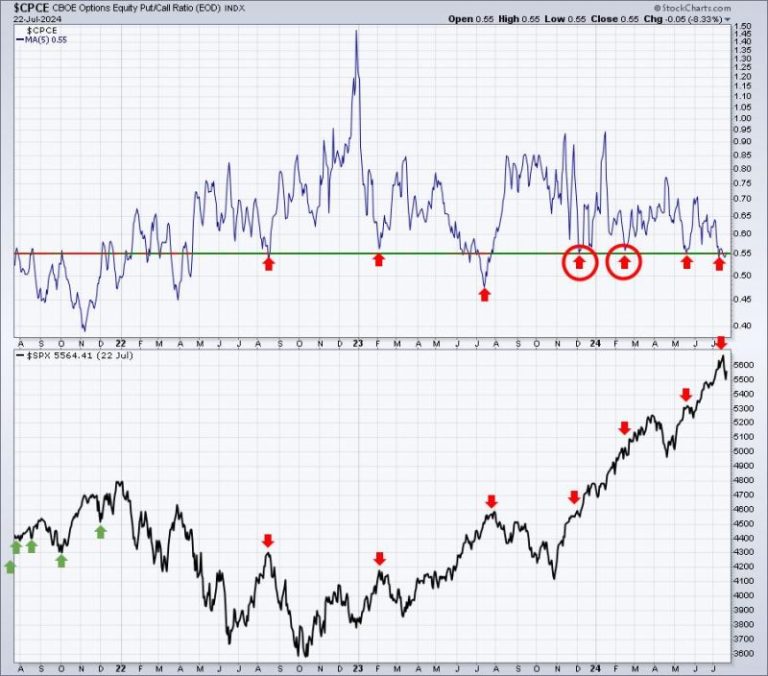
Chart Analysis: Identifying Possible Market Bottoms
Chart 1: Moving Averages
The first chart we will explore is the Moving Averages chart. Moving averages are essential tools for technical analysis as they help smooth out price movements and identify trends over a specific period. In the chart provided, we see three moving averages: the 50-day, 100-day, and 200-day moving averages.
A common strategy used by traders is to look for golden crosses and death crosses on moving average charts. When the short-term moving average crosses above the long-term moving average, it signals a potential bullish trend, known as a golden cross. Conversely, when the short-term moving average crosses below the long-term moving average, it indicates a possible bearish trend, referred to as a death cross.
In the chart, we should pay close attention to any potential golden or death crosses as they can provide valuable insights into the strength of the market trend and potential market bottoms.
Chart 2: Relative Strength Index (RSI)
The second chart we will analyze is the Relative Strength Index (RSI) chart. The RSI is a momentum oscillator that measures the speed and change of price movements. It ranges from 0 to 100 and is typically used to identify overbought or oversold conditions in a market.
In the chart provided, we can observe the RSI line fluctuating between the overbought (above 70) and oversold (below 30) levels. When the RSI surpasses the 70 level, it suggests that the market may be overbought, indicating a potential downward correction. On the other hand, when the RSI falls below 30, it indicates that the market may be oversold, suggesting a possible upward reversal.
By monitoring the RSI chart, traders can gain insights into the market sentiment and potential turning points that could signal a market bottom.
Chart 3: Volume Analysis
The third chart we will examine is the Volume Analysis chart. Volume is a critical indicator in technical analysis as it shows the level of activity and participation in the market. An increase in trading volume often confirms the strength of a current trend, while decreasing volume may indicate a weakening trend.
In the chart provided, we can observe the volume bars corresponding to price movements. Significant spikes in volume can signal key reversal points or trend continuations. Traders should watch for divergence between price movements and volume, as this can indicate potential reversals or confirmations of market bottoms.
By closely monitoring the volume analysis chart, traders can gauge market sentiment and identify potential market bottoms based on changes in trading activity.
In conclusion, analyzing these three charts – Moving Averages, Relative Strength Index, and Volume Analysis – can provide valuable insights into market trends and potential bottom formations. Traders should use these tools in conjunction with other technical indicators and fundamental analysis to make informed decisions and navigate the dynamic financial markets effectively.


